75% of internet users say: If your real estate agent web design is outdated and crappy, then you must be a crappy agent.
Yep. A survey confirmed that 75% of visitors JUDGE a business’s credibility based on it’s website design.
Ergo, many buyers and sellers looking at real estate agent websites are making snap judgements about your experience based on your site’s appearance.
Even if you rely on referrals or social media posts to get prospects, you still need a real estate website.
You might get a referral from a past client, but that referral will Google your name and find your website to check if you’re “legit.”
A potential seller may see your home valuation post on Facebook but they’ll still check your website before emailing you.
The Case for Aesthetics, the ROI of User Friendly Real Estate Agent Websites
People have high standards for real estate agent websites nowadays.
If you want your prospects to search MLS listings or read about your selling process, you need to make your website user-friendly. Otherwise, they’ll find another agent with a website that doesn’t give them a headache.
After all, there are hundreds of agents out there accessible in a single Google search.
81% of NAR members have real estate agent websites with IDX, according to NAR.
Multiple studies confirm this.
Every $1 spent on user experience (UX) or making a website more user-friendly, brings in $100 in return. That’s a 9,900% ROI.
Mobile internet users are 5x more likely to leave a website if it’s not optimized for mobile viewing.
94% of a visitor’s first impression on a website are on its structure, visual appearance, and navigation.
Keep reading if you want to learn how to build a real estate website that’s not just aesthetically pleasing but also functional for your prospects.
UX Tips for Building Real Estate Agent Websites Visitors Love
1. Stick to Predictable Menu Navigation
Repeat after me: don’t reinvent the wheel. Stick to what works.
Everyone looking to work with an agent expects a real estate web design to look a certain way:
- A page and expect to see a menu at the top or side
- A contact us button at the bottom of the page
- Contact information at the footer
- Search bar with filters for buy, rent, residential or commercial
- Links to different pages of the website are in a different colored text
If you stray too far from the expected, your website visitors will be confused. They’ll have to spend extra time to find the information they need to work with you.
Worse, they’ll exit your website and find the next one that Google shows them.
Tips for creating a user-friendly menu for real estate agent websites:
- Group related information: If you have multiple pages related to buying or selling, group them together into one main menu item, and several sub pages.
- Be descriptive on your menu titles: Don’t just stick to “About page,” go for short yet descriptive names like “About (Your Name)” or “LA Apartments for Rent” instead of “Properties for Rent”
Pro Tip: Use the 3 clicks rule for your real estate agents website. If a prospect can’t find the information they need in 3 clicks or less, that means your menu navigation and site map isn’t user friendly.
2. Add Helpful Links to the Footer
Many real estate agent websites with footer stick to the template provided. For many agents, they just put their contact information here and leave it at that.
The footer is the last thing a visitor sees on your website before they exit or go to another page. Fill it with useful information or links, such as:
- Contact page
- Social media links
- Blog link
- Testimonial
- Your contact information
- Name of your agency or brokerage
Related: 64% of internet users want to see a business’s contact information on their home page.
3. Put Important Content Above the Fold
“Above the Fold” refers to the important space a prospect sees upon landing on your site, right before they scroll down. Everything on that screen before they scroll is “above the fold”
Since many prospects will make snap judgements about real estate agent websites from the get go, it’s important the first thing they see is relevant to them.
What does this mean when it comes to designing real estate agent websites for solo realtors?
What’s above the fold will differ based on the page. A community page on Downtown Seattle, for instance, should show neighborhood information and relevant listings above the fold.
Meanwhile, the home page should include a clear headline that describes the agent’s transaction specialty and target market.
And whatever you include in this section, always make sure there’s a clear call-to-action and clickable button right before the part where visitors can scroll down. This can either be an invite to search for listings, or an invite to contact you.
Pro Tip: Use colors in contrast with your real estate web design for the call-to-action (CTA) buttons. Contrasting colors make the button stand out, and increase the conversion rates. It also helps to test descriptive language in the buttons. Try “Get in touch” or “Let’s talk” vs the generic “Contact us.”
4. Make Important Pages Accessible
Some pages in real estate agent websites are more important than others. You need to make sure they’re easy to find.
For example, an agent focusing on pre-construction properties should have a page dedicated to new projects, while an agent focusing on rentals should have a page dedicated to rental applications and requirements.
Tips to make important pages accessible:
- Always include a contact form at the bottom of each listing
- Include a link to schedule a property viewing on each listing
- Use borders and contrasting colors to make forms and scheduling links more prominent
- Use clear CTA button for important elements like featured listings or virtual tours
5. Clear Images
It’s obvious but it bears repeating: always use clear images in your real estate website design.
8 out of 10 people will exit a website, even if it has good content, if the images don’t load properly.
If you don’t use clear images, your prospects will assume that you’re not a serious agent. Many of them will think you’ll probably use sloppy pictures to promote their house, too.
Where to use images on real estate agent websites:
- Testimonials: show off pictures of you working with clients
- Selling page: picture of you on a property showing
- Buying page: picture of you and a client with closing documents or after getting an offer accepted
- Community pages: pictures of landmarks and the neighborhoods
- Blog posts: relevant pictures to the blog posts
- Home page: your picture, pictures of you in action
Related: Watch this video to learn how to add an image to real estate agents websites made with Web4realty.
Wanna see what a good real estate web design looks like? Take a look at this agent’s selling page.
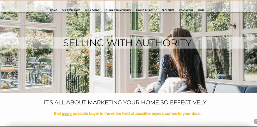
- Scannable content with great icons
- Video that explains her sales process (Bonus!)
- Clear headline
- Descriptive and user friendly menu navigation
- Clear call to action (CTA) at the bottom
6+ Helpful Tools and Pages that Convert More Visitors into Prospects
Property listings aren’t the only stuff a prospect will check on real estate agent websites. They also need help to make a decision.
Below are some of the real estate tools a prospect will appreciate on your website:
- Mortgage calculator
- Mortgage insurance calculator
- Market updates
- Property Map
- Vendors or utility listings
- Transfer tax calculator
Here’s an example of a real estate web design that includes several helpful tools grouped together in the menu.
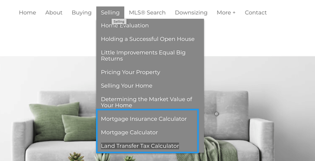
Web4Realty’s real estate website builder includes several calculators that you can drag and drop to any page of your website. Here’s what they look like on a live site:
It even has helpful prompts built in, so your visitors will know what to do first.

Market Updates
Including market updates on your real estate website is totally optional, but these updates add a touch of credibility to your agency. It shows visitors that you’re an expert in your market, and can help them get the best offer.
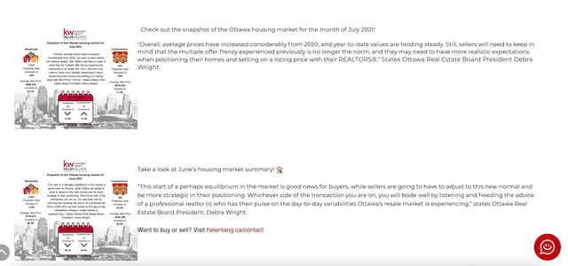
One of our members, Helen Tang, has a section dedicated to market updates on her real estate website.
FAQ
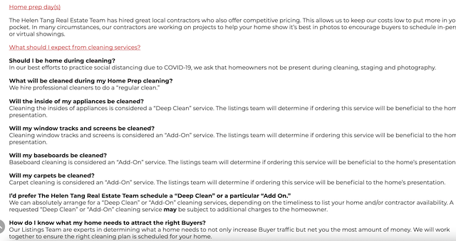
Compile all the possible questions a buyer or seller may ask in one page. You can also compile the questions at the bottom of the buying or selling page of your site.
These FAQs will address hesitations a prospect may have, and save you the time from answering the same questions over and over. It’s a win-win.
Keeping Up with Technology shouldn’t be an Excuse to Have a Lousy Website
“45% of brokers say keeping up with technology is the biggest challenge for their agents.”
Yes, it’s a struggle for everyone. Even programmers have to keep up with advancements like new coding languages and new tools.
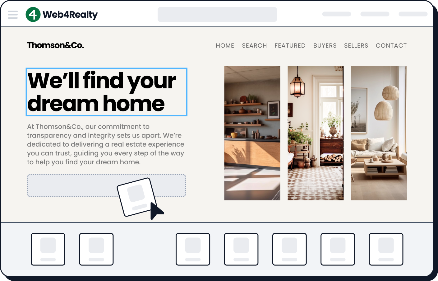
The thing is you don’t need to be familiar with the latest tools to start building a real estate website. Real estate website builders like Web4Realty make the job easier for you.
Related: Web4Realty vs Placester, Web4Realty vs WebsiteBox: How do these real estate website builders compare in terms of features, pricing, and design options?
Start with one of the templates we provide, and from there you can create solo real estate agent websites that’s user-friendly and includes all the information a prospect may need before contacting you.
Related: Looking for other types of real estate agent websites? We also have examples for commercial real estate website design and websites for real estate brokers.

